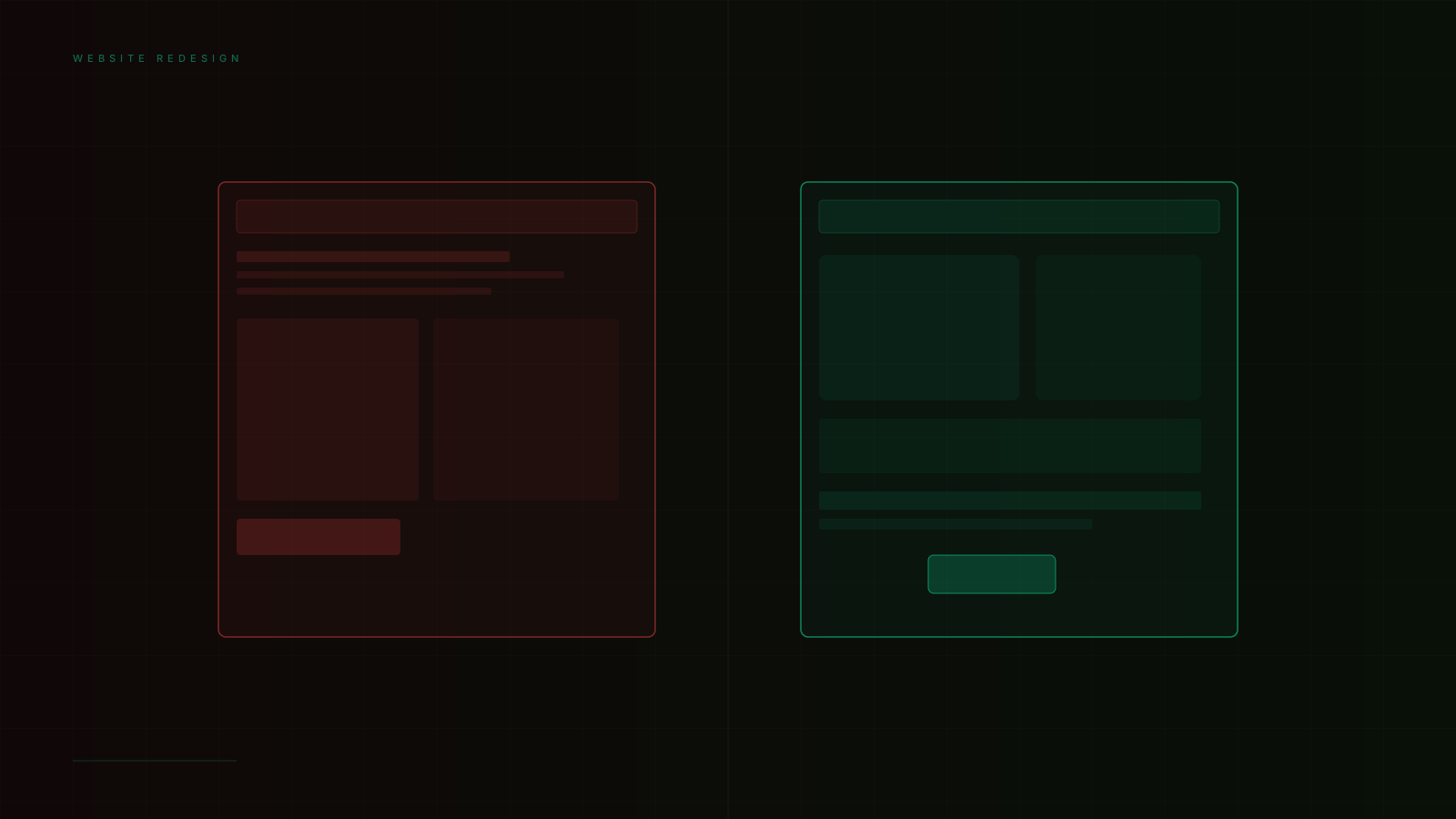
# 8 Signs Your Website Redesign Is Already Overdue
Websites don't announce when they've become liabilities. They don't stop working; they just stop converting. The leads slow gradually. The bounce rate creeps up. The sales calls include more "I had a look at your site and..." with a pause that says more than what follows.
The redesign decision is almost always reactive — triggered by something obvious enough to create organizational urgency. The better approach is to recognize the signals earlier, before the site has cost you the opportunities you'll never know you lost.
## Sign 1: Your Bounce Rate Is High and Rising
A high bounce rate — visitors who leave your site after viewing a single page — can indicate several things: wrong traffic (ads targeting the wrong audience), slow page load, or a first impression that doesn't match the visitor's expectations.
The redesign signal is specifically when bounce rate is high even for qualified traffic. If a visitor who matches your ideal customer profile arrives from a relevant search term and leaves without engaging further, the first-impression experience failed them. That failure is almost always visual and structural — the page didn't immediately communicate what it offered, or what it communicated didn't match their expectation.
## Sign 2: You're Not Converting Visitors to Contacts
A website with traffic but minimal contact form submissions, trial sign-ups, or phone calls is a website that's not doing its job. The gap between traffic and conversion is either a messaging problem (what you're saying doesn't resonate), a trust problem (visitors aren't confident enough to reach out), or a friction problem (the path to contact is unclear or difficult).
All three causes have design solutions: clearer value proposition communication, stronger social proof architecture, reduced friction in the contact pathway. If those solutions have been applied incrementally and the conversion rate remains low, a structural redesign is usually more effective than continued patching.
## Sign 3: The Site Doesn't Reflect Your Current Business
Businesses evolve. Services change, positioning shifts, target audiences expand, pricing moves upmarket. Websites often don't keep pace. The result is a disconnect between who you are and how you present yourself — which creates confusion for prospects trying to evaluate whether you're the right fit for their specific need.
A website that accurately described the business 4 years ago and hasn't been updated structurally since is communicating an outdated story. The parts that have been updated are usually individual pages or copy sections; the information architecture, the navigation model, and the visual hierarchy usually reflect the old structure. Patching copy can't fix an outdated information architecture.
## Sign 4: It Fails on Mobile
Mobile now accounts for over 60% of web traffic globally. A website that was designed primarily for desktop in 2017 and retrofitted to mobile with responsive CSS is not a mobile website — it's a desktop website that displays on mobile. The experience quality is different, and users feel the difference even when they can't articulate why.
Signs of a mobile experience that needs more than patching: text that's too small to read without pinching, touch targets that are difficult to hit reliably, content that requires horizontal scrolling, navigation patterns designed for cursor interaction that feel awkward on touch.
## Sign 5: It's Slow
If your website scores below "Good" on Google's Core Web Vitals — Largest Contentful Paint above 2.5 seconds, Cumulative Layout Shift above 0.1 — you're losing rankings and users simultaneously. The performance problem is often structural: the technology choices made when the site was built are creating ceilings on what performance optimization can achieve.
An older WordPress site with accumulated plugins, a Wix or Squarespace site on shared infrastructure, or a site built on a page builder that generates bloated HTML often can't be optimized to modern performance standards without rebuilding.
## Sign 6: Your Competitors Look Significantly Better
Your website doesn't exist in a vacuum — it's evaluated by every prospect who is also evaluating your competitors. If the visual quality gap between your site and your top competitors has grown significantly in the past 2 years, that gap is showing up in your relative conversion rates.
This isn't about following trends. It's about the minimum visual standard expected by your target audience in your specific category. If that standard has moved — and it moves regularly — maintaining a site built to the old standard is a competitive disadvantage.
## Sign 7: Your Team Is Embarrassed to Share It
The internal embarrassment test is one of the most reliable indicators. If your sales team hesitates to send prospects to the website, if your marketing team apologizes for the design in client presentations, if the CEO's company LinkedIn profile links somewhere other than the homepage — the internal vote of no confidence is a significant signal.
The people who interact most with prospects and know the business best are making a judgment that the website doesn't represent the quality of the actual offering. That judgment is usually correct.
## Sign 8: It Was Last Redesigned More Than 4 Years Ago
Website design conventions, user expectations, performance standards, and SEO requirements all evolve over 4-year cycles. A website designed in 2020 was built for the technology and user expectations of 2020. It's not that it fails immediately — it's that the gap grows steadily, and at some point the accumulated distance is too wide to bridge with updates.
Four years is not a hard rule. A site that was exceptionally well-designed and has been consistently maintained can remain competitive longer. But it's a reasonable default trigger for an honest evaluation.
## What a Redesign Should Accomplish
A website redesign is not a visual refresh — it's a strategic rebuild. It starts with the question: what is this website supposed to do, for whom, and how should it do it differently than the current site?
The answers drive every decision that follows: the information architecture, the content strategy, the design direction, the technical choices. A redesign that starts from "we want it to look like X" without this strategic foundation produces a more attractive version of the same strategic failures.
## Frequently Asked Questions
**How long does a professional website redesign take?**
For a 5–8 page business website: 4–8 weeks from strategy through launch. For a larger site with custom functionality or e-commerce: 8–16 weeks. Timeline variables include the availability of content (written copy and photography) and the speed of client feedback cycles.
**Should I redesign content and visuals at the same time?**
Yes. Visual design and content strategy are interdependent — the design should be shaped by what needs to be communicated, and what gets communicated should be shaped by the design hierarchy. Redesigning visuals on top of old content produces a site that looks new but communicates the same way as the old one. Start with content strategy.
**What's the right budget for a professional website redesign?**
Depends on the scale and complexity of the site. For a professional business website (5–8 pages, no e-commerce): $2,000–$5,000 for design. Development costs depend on the technology choice. Budget for design, development, copywriting, and photography separately — all four are required for a complete, high-quality result.
## Don't Wait for the Obvious Signal
By the time it's obvious that your website needs rebuilding, it's been costing you for longer than you know. The right time to redesign is when the signals are there — not when the damage is undeniable.
[View Website Design Work](/portfolio) or [Start a Project](/contact).